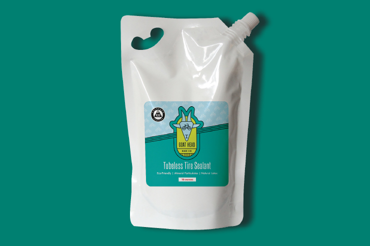
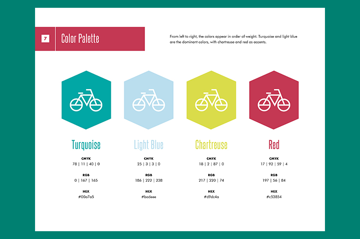
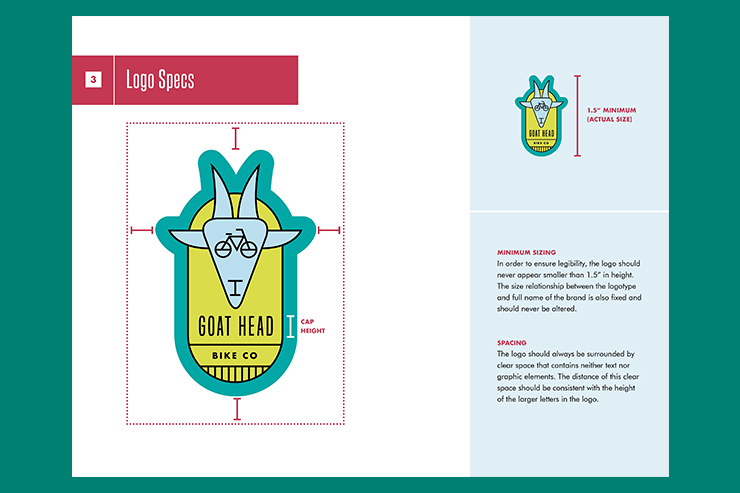
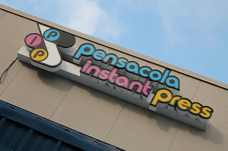
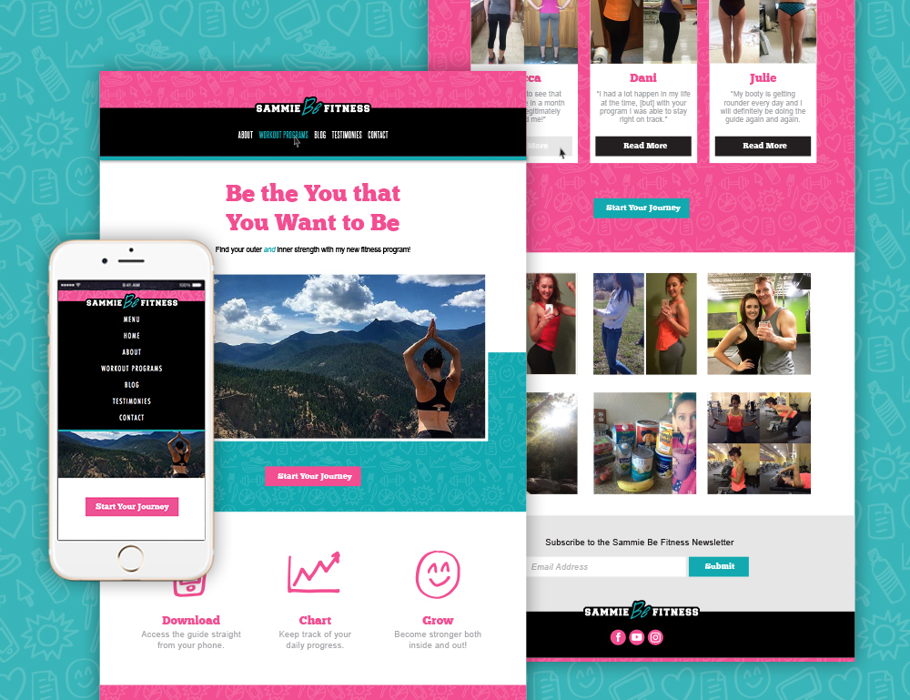
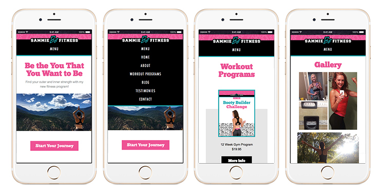
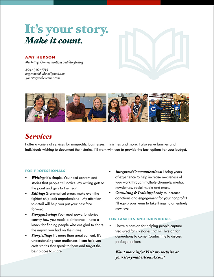
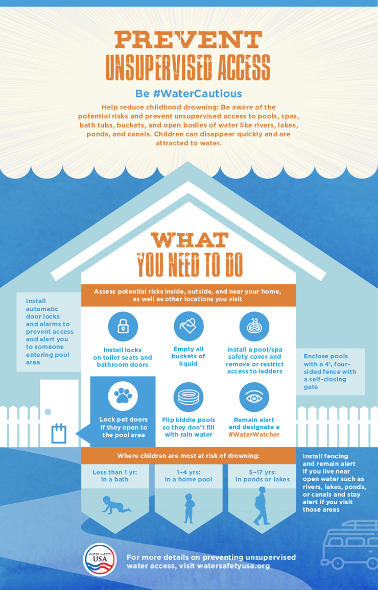
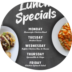
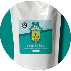
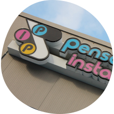
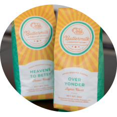
I've been a graphic designer for the past 10 years, working as a freelancer as well as the in-house designer for the Pool & Hot Tub Alliance, Atlanta Community Food Bank, TSS Photography and Pensacola Instant Press.
Please take a look around to see some of my work, and let me know if there is anything I can do for you!
Request a Proposal
Cohesive Event Design
Food Bank Partner Agency Conference
This design was for the Atlanta Community Food Bank’s 2016 Partner Agency Conference. To emphasize the growth aspect of the year’s theme, I wanted to add a natural element with the leaf and wood textures, while the brush strokes were used to imply both a personal element as well as the act of creating something together. I designed the identity for the event as well as collateral including programs, certificates, name tags, passport booklets, centerpieces, signage and PowerPoints.
Cohesive Event Design
My Wedding
I really enjoyed the creative freedom of designing my wedding. I hinted at a subtle vintage travel theme, since I love vintage and my husband is learning to fly. A script font gave the look elegance and served to tie all the pieces together. I deigned a stamp which we used on our favor bags and envelopes, inserted star-shaped brads for highlights on the map and used acetone transfers for the addresses to give them a worn look. The collateral included save-the-dates, invitations, response cards, maps, cake toppers, centerpieces and favors.
Layout Design
Foodsharing Newsletter
Foodsharing is the quarterly newsletter of the Atlanta Community Food Bank. When this piece was brought in-house, my manager and I worked together to completely revamp it from top to bottom. I applied the Food Bank's existing brand but completely redid the layout. Due to a cleaner design, fewer pages, more cost-effective paper and a content emphasis on how donated money directly effects families, this piece went from costing the Food Bank money to earning them enough money to pay for itself and then some.
Layout Design
Annual Report
Each year, the Atlanta Community Food Bank’s annual report has a different theme. For 2012-2013, that theme was “Together We Can,” which I emphasized through photography, infographics and content. I took some of the photography used in the report, such as the front cover and paper airplane, and managed the deadline calendar as well as content collection and layout design. It received a Gold Hermes Creative Award and was the only recipient in that category from Georgia that year.
Branding Identity
Gina Sims Designs
I worked together with Gina Sims, an interior designer from Atlanta, to create a logo and branding identity that would reflect her design style. The hexagon and watercolors of her logo are inspired by elements that she often incorporates into her designs as terrariums and wall art, and the color palette was inspired by her love of bold, unique colors.
Branding Identity
Potluck & Pitch
The Potluck & Pitch event, hosted by the Atlanta Community Food Bank, brings together entrepreneurs from around the city to a potluck lunch and allows them to share their ideas about bringing affordable, fresh and healthy food choices to underserved Atlanta neighborhoods. The winning concept receives a check that goes toward getting their idea off the ground. I chose to hand draw the mark to portray the grassroots element as well as the personal passion of the participants. I wanted to visually portray both the idea aspect as well as the food theme, so the visual pun of the lightbulb and pear was born.
Branding Identity
Anatu Analytical Instruments
Anatu was looking for a design that was scientific, so I presented them with several concepts that included elements such as orbits, explosions, EKG readings etc. The winning design was one that symbolizes atoms orbiting a nucleus. I kept the website design clean, using grays and whites to give the feel of a lab or hospital environment, and pops of orange and teal as accents.
Large Format
Atlanta Community Food Bank Truck Wraps
When I began working for the Food Bank, they had recently completed a rebrand, so as the in-house designer, my job was to uphold its integrity and creatively apply the brand to various materials. One of the larger projects that I worked on was making over our fleet of trucks. A big focus for the Food Bank during this time was changing the perception that non-perishable items were ideal; Food Banks were actually far more interested in receiving fresh fruit and vegetable donations. So on the wraps—though I was sure to include a can—the main focus was on the produce. I also worked with the vendors to compare prices and schedule installations, which was particularly challenging since our donated trucks were various shapes and sizes. The cabs and back doors of each truck were painted, and the design of the wraps themselves were cut out so they used less material and could be easily adapted to different sizes.
Rebrand and Signage
Pensacola Instant Press
Pensacola Instant Press was my first in-house position. While there, I rebranded the company logo, giving it a round font that complimented the printing press graphic which was part of the old logo, and gave it a true CMYK color palette. I applied the new logo to business cards and invoices, and crafted sample paper booklets for the convenience of their customers. Finally, I worked with the vendor to have the new logo installed on the outside of the building.
Responsive Website Design
Sammie Be Fitness
For this bubbly fitness enthusiast, I created an energetic, playful branding identity that reflected her personality. I then applied the identity to a responsive website and downloadable fitness programs. The website was designed from scratch in Dreamweaver using HTML/CSS, incorporating Javascripts for popups and scrolling features and using media queries for responsiveness.
Responsive Website Design
Legends of Atlanta Roast
The Legends of Atlanta Roast is a fundraising event hosted by the Atlanta Community Food Bank that involves an elegant dinner and features a roast of three famous Atlanta restauranteurs. This year, the event asked for a more modern look that suggested the intimate feel of the evening without being too dark. I achieved this with a scrolling site design that allowed me to separate the sections with colors and images. It was also a big step forward to make the site responsive for the first time, which I did using media queries. I was provided with the logo, but I created the rest of the branding palette including colors and fonts. The site was constructed in Dreamweaver using HTML/CSS and incorporating Javascripts for popups and scrolling features.
Responsive Website Design
Twin Waters Jewelry
The goal for Twin Waters Jewelry was to create a clean design with a beachy theme. I did that using photos, textures, and fonts, but also by making sure to leave a lot of white space and breathing room for the content. The site was built from scratch using HTML and CSS in Dreamweaver and is fully responsive.